This website is managed by Ultima Markets’ international entities, and it’s important to emphasise that they are not subject to regulation by the FCA in the UK. Therefore, you must understand that you will not have the FCA’s protection when investing through this website – for example:
You will not be guaranteed Negative Balance Protection
You will not be protected by FCA’s leverage restrictions
You will not have the right to settle disputes via the Financial Ombudsman Service (FOS)
You will not be protected by Financial Services Compensation Scheme (FSCS)
Any monies deposited will not be afforded the protection required under the FCA Client Assets Sourcebook. The level of protection for your funds will be determined by the regulations of the relevant local regulator.
Note: UK clients are kindly invited to visit https://www.ultima-markets.co.uk/. Ultima Markets UK expects to begin onboarding UK clients in accordance with FCA regulatory requirements in 2026.
If you would like to proceed and visit this website, you acknowledge and confirm the following:
1.The website is owned by Ultima Markets’ international entities and not by Ultima Markets UK Ltd, which is regulated by the FCA.
2.Ultima Markets Limited, or any of the Ultima Markets international entities, are neither based in the UK nor licensed by the FCA.
3.You are accessing the website at your own initiative and have not been solicited by Ultima Markets Limited in any way.
4.Investing through this website does not grant you the protections provided by the FCA.
5.Should you choose to invest through this website or with any of the international Ultima Markets entities, you will be subject to the rules and regulations of the relevant international regulatory authorities, not the FCA.
Ultima Markets wants to make it clear that we are duly licensed and authorised to offer the services and financial derivative products listed on our website. Individuals accessing this website and registering a trading account do so entirely of their own volition and without prior solicitation.
By confirming your decision to proceed with entering the website, you hereby affirm that this decision was solely initiated by you, and no solicitation has been made by any Ultima Markets entity.
Learn what a stock heat map is, how to read market sectors, and how traders spot momentum, risk and opportunities in seconds using visual data fast view.
A stock heat map is one of the most efficient visual tools in modern market analysis. Instead of scanning hundreds of individual charts, traders use a stock heat map to instantly understand what the market is doing as a whole.
Whether you are a beginner trying to understand market movement or an active trader looking for quick sector signals, the stock heat map helps simplify complex market data into a clear visual structure.
In this guide, we will break down how a stock heat map works, how professionals use it, and what most traders overlook when reading it.
What is a Stock Heat Map?
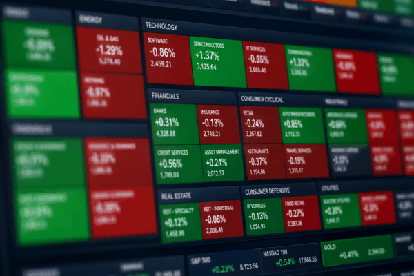
A stock heat map is a visual representation of the stock market where each company is shown as a coloured block. These blocks are grouped by sectors such as technology, financials, healthcare and energy.
Each block usually contains three key layers:
Identity: the stock itself
Size: market capitalisation
Colour: price performance over a selected timeframe
Green typically represents gains, while red represents losses. The stronger the colour, the stronger the move.
This structure allows a stock heat map to display the entire market in one view, making it easier to identify which areas are strong or weak.
Sections of a Stock Heat Map
To understand a stock heat map properly, you need to understand how the data is built.
1. Performance Layer (Colour)
Each stock is coloured based on its percentage change. Intraday or daily changes are most common.
2. Market Capitalisation Layer (Size)
Large companies appear bigger on the map. This is important because a few mega-cap stocks can heavily influence index movement.
3. Sector Layer (Grouping)
Stocks are grouped into sectors, which helps traders identify whether an entire industry is moving together.
Platforms like TradingView provide interactive stock heat map tools that update in real time, allowing traders to zoom into sectors and individual stocks quickly.
Why Traders Use a Stock Heat Map
The main advantage of a stock heat map is speed. It turns thousands of price movements into a single visual snapshot.
Here is why traders rely on it:
Market Sentiment in Seconds
A stock heat map immediately shows whether the market is risk-on or risk-off.
Sector Strength and Weakness
You can quickly see which sectors are leading and which are lagging behind.
Opportunity Detection
Strong green clusters often highlight momentum stocks, while red clusters may reveal weakness or short setups.
Index Influence Awareness
A stock heat map also helps traders understand whether market movement is broad or driven by a few large stocks.
The Most Important Concept: Market Breadth
One of the most overlooked aspects of a stock heat map is market breadth.
Market breadth refers to how many stocks are participating in a move.
For example:
If only a few large stocks are green, the index may look strong but is actually narrow
If most sectors are green, the move is broad and healthier
This is important because a stock heat map can sometimes hide weakness if a few mega-cap stocks dominate the index.
Understanding this difference is what separates beginners from more advanced traders.
Sector Rotation and Institutional Behaviour
Professional traders and funds use a stock heat map to track sector rotation.
Sector rotation happens when money moves from one sector to another, for example:
From technology into energy
From growth stocks into defensive stocks
From cyclical sectors into utilities or healthcare
This is often linked to macroeconomic expectations such as interest rates, inflation, or growth outlook.
Institutional platforms like Finviz make it easier for retail traders to observe these rotations using free sector heat maps.
Meanwhile, data providers like Bloomberg combine stock heat map visuals with news flow and macroeconomic updates, which is how professional desks confirm whether a trend is sustainable.
How to Read a Stock Heat Map Correctly
Many traders misinterpret a stock heat map because they focus only on colour.
Here is a better approach:
Step 1: Identify dominant sectors
Look for clusters of green or red in specific industries.
Step 2: Check market cap influence
A single large red stock can outweigh multiple small green ones.
Step 3: Confirm market breadth
Check whether movement is broad or concentrated.
Step 4: Combine with technical analysis
A stock heat map should always be confirmed with charts, volume and indicators.
Common Mistakes When Using a Stock Heat Map
Even though a stock heat map is simple to use, traders often make avoidable mistakes:
1. Treating it as a prediction tool
A stock heat map shows current conditions, not future direction.
2. Ignoring index weighting
Large stocks can distort the overall picture.
3. Overreacting to one sector
One strong sector does not always mean the entire market is bullish.
4. Using it in isolation
It should always be combined with other technical or macro tools.
How Professionals Use Stock Heat Maps in Strategy
A stock heat map is not just a visual tool. It is often part of a structured trading workflow.
Intraday trading
Traders use it at market open to identify early momentum stocks.
Swing trading
It helps identify strong sectors for short- to medium-term positioning.
Macro analysis
Funds use it to assess risk sentiment across entire markets.
ETF tracking
Many professionals track ETF flows alongside heat maps to confirm whether sector moves are supported by real capital rotation.
Best Platforms for Stock Heat Maps
Different tools serve different levels of traders:
TradingView
Best for interactive and customisable real-time stock heat map views.
Finviz
Best free option for quick market overview and sector scanning.
Bloomberg
Best institutional-grade solution combining stock heat map data with macro news and analytics.
Each platform offers a different depth of insight, depending on whether you are a retail trader or institutional user.
Why Stock Heat Maps Matter in Modern Trading
The financial market is becoming faster and more data-driven. A stock heat map helps simplify that complexity by showing real-time sentiment in a visual format.
Instead of analysing one stock at a time, traders can instantly understand:
Where money is flowing
Which sectors are leading
Whether the market is broad or narrow
This makes the stock heat map a key starting point for daily trading decisions.
Conclusion
A stock heat map is more than just a colourful chart. It is a structured view of market behaviour that helps traders quickly interpret sentiment, sector rotation and market strength.
However, its real value comes when it is used correctly. By combining a stock heat map with technical analysis, macro awareness and volume confirmation, traders can build a much clearer picture of market conditions.
Used properly, the stock heat map becomes a powerful shortcut to understanding the market in seconds rather than hours.
FAQs
What does a stock heat map show?
It shows market performance using colours and block sizes to represent stocks and sectors.
Is a stock heat map useful for beginners?
Yes, it simplifies complex market data into an easy visual format.
Can a stock heat map predict price movements?
No, it only reflects current performance, not future direction.
What is the best use of a stock heat map?
It is best used for identifying sector strength, market sentiment and rotation trends.
Share Now
Disclaimer:This content is provided for informational purposes only and does not constitute, and should not be construed as, financial, investment, or other professional advice. No statement or opinion contained herein should be considered a recommendation by Ultima Markets or the author regarding any specific investment product, strategy, or transaction. Readers are advised not to rely solely on this material when making investment decisions and should seek independent advice where appropriate.
Thank you for visiting the Ultima Markets website. Please note that this website is intended for individuals residing in jurisdictions where access is permitted by law. Ultima and its affiliated entities do not operate in your home jurisdiction.
By clicking ‘Acknowledge’, you confirm that you are entering this website solely on your own initiative and not as a result of any specific marketing outreach. You wish to obtain information from this website based on reverse solicitation principles, in accordance with the applicable laws of your home jurisdiction.