Ultima Markets App
Trade Anytime, Anywhere
Important Information
This website is managed by Ultima Markets’ international entities, and it’s important to emphasise that they are not subject to regulation by the FCA in the UK. Therefore, you must understand that you will not have the FCA’s protection when investing through this website – for example:
- You will not be guaranteed Negative Balance Protection
- You will not be protected by FCA’s leverage restrictions
- You will not have the right to settle disputes via the Financial Ombudsman Service (FOS)
- You will not be protected by Financial Services Compensation Scheme (FSCS)
- Any monies deposited will not be afforded the protection required under the FCA Client Assets Sourcebook. The level of protection for your funds will be determined by the regulations of the relevant local regulator.
Note: Ultima Markets is currently developing a dedicated website for UK clients and expects to onboard UK clients under FCA regulations in 2026.
If you would like to proceed and visit this website, you acknowledge and confirm the following:
- 1.The website is owned by Ultima Markets’ international entities and not by Ultima Markets UK Ltd, which is regulated by the FCA.
- 2.Ultima Markets Limited, or any of the Ultima Markets international entities, are neither based in the UK nor licensed by the FCA.
- 3.You are accessing the website at your own initiative and have not been solicited by Ultima Markets Limited in any way.
- 4.Investing through this website does not grant you the protections provided by the FCA.
- 5.Should you choose to invest through this website or with any of the international Ultima Markets entities, you will be subject to the rules and regulations of the relevant international regulatory authorities, not the FCA.
Ultima Markets wants to make it clear that we are duly licensed and authorised to offer the services and financial derivative products listed on our website. Individuals accessing this website and registering a trading account do so entirely of their own volition and without prior solicitation.
By confirming your decision to proceed with entering the website, you hereby affirm that this decision was solely initiated by you, and no solicitation has been made by any Ultima Markets entity.
I confirm my intention to proceed and enter this website Please direct me to the website operated by Ultima Markets , regulated by the FCA in the United KingdomA Complete Guide on the Renko Charts
In the world of technical analysis, traders use a variety of tools to help them understand market movements and make informed decisions. One such tool is the Renko chart, which offers a unique approach to charting that can be particularly valuable for identifying trends and filtering out market noise. If you’re new to Renko charts or looking to deepen your understanding of how they work, this guide will take you through the essentials.
What Are Renko Charts?
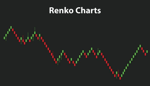
Renko charts are a type of price-based chart used to display market trends. Unlike traditional charts, such as candlestick or bar charts, Renko charts don’t account for time. Instead, they focus purely on price movements. The term “Renko” is derived from the Japanese word “renga”, which means brick. This is because the chart visually resembles a series of bricks that are stacked together to represent price changes.
Each “brick” in a Renko chart represents a specific price movement, defined by the trader. The key feature of Renko charts is their ability to eliminate small price fluctuations, making it easier to spot clear trends without getting distracted by the market’s day-to-day noise.
How Do Renko Charts Work?
The Renko chart is built based on the concept of a box size, a predefined price movement required to form a new brick. For example, if you set the box size to 10 points, a new brick is added to the chart when the price moves up or down by 10 points. This eliminates small, insignificant movements and highlights only the larger price swings that may signal a potential trend.
Here’s how it works:
- New brick formation: If the price moves beyond the box size, a new brick is added in the direction of the price movement.
- Price reversal: If the price moves in the opposite direction by the box size, a new brick is formed in the reverse direction.
- No time consideration: Renko charts do not take time into account, meaning that price movements are the only factor determining the formation of bricks.
Why Use Renko Charts?
1. Trend Identification
Renko charts are particularly useful for identifying strong trends. Since they ignore minor price fluctuations, they help traders focus on significant price moves. This makes it easier to spot trends and stay in them longer, whether the market is trending upwards or downwards. The cleaner view of the market allows traders to identify potential breakouts or reversals earlier than with other chart types.
2. Noise Reduction
One of the primary advantages of Renko charts is their ability to eliminate market noise. Traditional candlestick charts can become cluttered with small price movements that are irrelevant to the overall market trend. Renko charts filter out these tiny movements, leaving behind only the larger, more meaningful price shifts. This can help traders make more informed decisions based on cleaner data.
3. Clear Entry and Exit Points
The Renko chart makes it easier to identify entry and exit points. When the price starts to form bricks in one direction, traders can view this as the beginning of a new trend. Conversely, when the direction of the bricks reverses, it can signal the end of a trend and a potential time to exit the market. This clear visual representation helps traders stay on top of their positions.

How to Use Renko Charts in Trading
The Renko chart can be used as part of a trend-following strategy. Here are a few ways traders commonly incorporate Renko charts into their trading plans:
1. Spotting Trend Reversals
Renko charts excel at highlighting trend reversals. When the price reverses direction after a series of bricks in one direction, it signals a potential trend change. Traders can use this information to enter trades early in the trend, maximizing profits.
2. Combining with Other Indicators
While Renko charts are effective on their own, they work even better when combined with other technical indicators. For example:
- Moving Averages: Traders often use moving averages in conjunction with Renko charts to confirm the direction of the trend and filter out false signals.
- Relative Strength Index (RSI): By combining RSI with Renko charts, traders can assess whether a trend is overbought or oversold, helping to time entries and exits more effectively.
3. Support and Resistance Levels
The Renko chart is excellent for identifying support and resistance levels. These are key price points where the market tends to reverse direction. Traders can use Renko charts to spot these levels, which can help guide trading decisions.
Limitations of the Renko Chart
While Renko charts have many advantages, they are not without their drawbacks. Traders should be aware of these limitations when using them:
1. No Time Information
Since Renko charts don’t include time on the horizontal axis, they can make it difficult to track specific price movements over time. This is a disadvantage when precise timing is crucial to your trading strategy.
2. Box Size Selection
The effectiveness of a Renko chart depends on the selection of the box size. If the box size is too large, important price movements may be missed. On the other hand, if the box size is too small, the chart may become cluttered with unnecessary price movements. Finding the right box size requires testing and adjustment.
3. Lagging Indicator
Renko charts can lag behind the market during periods of low volatility. Since a brick forms only after the price moves a certain distance, it can take longer for the chart to catch up with market changes during sideways price action.

Conclusion
The Renko chart is a valuable tool for traders looking to filter out market noise and focus on key price movements. Their ability to highlight trends clearly and eliminate small fluctuations makes them a popular choice for identifying long-term trends, spotting reversals, and setting entry and exit points.
However, like any tool, Renko charts are not without their limitations. They lack time-based information and may require fine-tuning of the box size to be most effective. When used in combination with other technical indicators and strategies, Renko charts can be a powerful addition to a trader’s toolkit.
By understanding how Renko charts work and applying them strategically, traders can make more informed decisions and improve their overall trading performance.
Disclaimer: This content is provided for informational purposes only and does not constitute, and should not be construed as, financial, investment, or other professional advice. No statement or opinion contained here in should be considered a recommendation by Ultima Markets or the author regarding any specific investment product, strategy, or transaction. Readers are advised not to rely solely on this material when making investment decisions and should seek independent advice where appropriate.


