
Ultima Markets App
Trade Anytime, Anywhere
Important Information
This website is managed by Ultima Markets’ international entities, and it’s important to emphasise that they are not subject to regulation by the FCA in the UK. Therefore, you must understand that you will not have the FCA’s protection when investing through this website – for example:
- You will not be guaranteed Negative Balance Protection
- You will not be protected by FCA’s leverage restrictions
- You will not have the right to settle disputes via the Financial Ombudsman Service (FOS)
- You will not be protected by Financial Services Compensation Scheme (FSCS)
- Any monies deposited will not be afforded the protection required under the FCA Client Assets Sourcebook. The level of protection for your funds will be determined by the regulations of the relevant local regulator.
Note: Ultima Markets is currently developing a dedicated website for UK clients and expects to onboard UK clients under FCA regulations in 2026.
If you would like to proceed and visit this website, you acknowledge and confirm the following:
- 1.The website is owned by Ultima Markets’ international entities and not by Ultima Markets UK Ltd, which is regulated by the FCA.
- 2.Ultima Markets Limited, or any of the Ultima Markets international entities, are neither based in the UK nor licensed by the FCA.
- 3.You are accessing the website at your own initiative and have not been solicited by Ultima Markets Limited in any way.
- 4.Investing through this website does not grant you the protections provided by the FCA.
- 5.Should you choose to invest through this website or with any of the international Ultima Markets entities, you will be subject to the rules and regulations of the relevant international regulatory authorities, not the FCA.
Ultima Markets wants to make it clear that we are duly licensed and authorised to offer the services and financial derivative products listed on our website. Individuals accessing this website and registering a trading account do so entirely of their own volition and without prior solicitation.
By confirming your decision to proceed with entering the website, you hereby affirm that this decision was solely initiated by you, and no solicitation has been made by any Ultima Markets entity.
I confirm my intention to proceed and enter this website Please direct me to the website operated by Ultima Markets , regulated by the FCA in the United Kingdom

K-Line Chart: Learn How to Read and Use It in Trading
K-Line chart, also known as candlestick chart, are among the most widely used tools in technical analysis. They provide traders with detailed insights into price movements over a specific time frame, making them essential for informed trading decisions.
In this guide, we’ll break down the key components of a K-Line chart, explain its applications in trading, and show you how to interpret them effectively.
What is a K-Line Chart?

A K-Line chart is a graphical representation of an asset’s price action during a given period. Each candlestick summarises four critical data points:
- Open price – The price when the period started.
- Close price – The price when the period ended.
- Highest price – The peak price within the period.
- Lowest price – The lowest price within the period.
Each candlestick visually represents these prices, showing how the market behaved during that time frame. Unlike simple line charts, K-Line charts offer more detail, helping traders analyse market trends, sentiment, and potential reversals.
Key Components of K-Line Charts
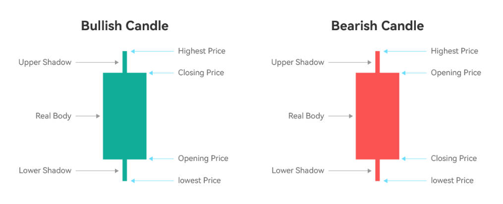
The body of a K-Line chart is central to its interpretation, representing the difference between the opening and closing prices of an asset. Each individual element on the chart is called a candle, and its features are key to technical analysis. Its main elements include:
- The Body:
A filled (or hollow) shape that shows whether the closing price was higher or lower than the opening price:- Green or white body: Closing price is higher than opening (bullish), indicating that bulls are in control and pushing prices upward.
- Red or black body: Closing price is lower than opening (bearish), showing that bears are dominating and driving prices downward.
- Upper Shadow (Wick):
The thin line above the body, known as the upper wick, indicates the highest price reached during the period. - Lower Shadow (Wick):
The line below the body, called the lower wick, shows the lowest price reached during the period.
Generally, traders interpret the position of the body and wicks to determine whether bulls or bears are in control and to assess the current market trend. Conversely, a strong bullish candle with a long body and short wicks suggests sustained buying pressure, while a bearish candle with a long body and short wicks signals dominant selling by bears.
The connection between the candle’s features, such as the size and position of the body and wicks, and the overall trend or potential reversal helps traders determine market sentiment and make informed decisions.
These components together provide insights into price dynamics, strength of trends, and potential reversal points.
K-Line Chart vs. Candlestick Chart
The terms K-Line chart and candlestick chart refer to the same type of chart. Both display the open, close, high, and low prices for a given time period, making them far more informative than a line chart.
Candlestick charts originated in Japan centuries ago and later became popular worldwide, while the term “K-Line” is commonly used in Chinese markets. Today, both terms are interchangeable in technical analysis.
Applications of the K-Line Chart in Trading
K-Line charts are widely used in different financial markets, like stocks, forex, commodities, and cryptocurrencies because they offer a detailed look at price action for any security. Unlike a box plot, which uses a box to show data distribution, K-Line charts visually represent price movements and trading information in a different way. Here’s how traders apply them:
- Identifying Market Trends
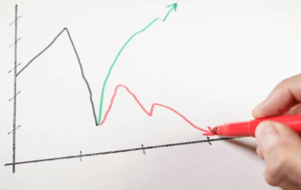
Consecutive bullish candles (green) may indicate an uptrend, while multiple bearish candles (red) signal a downtrend. Traders also watch for key support levels, where the price of a security may find a floor and potentially reverse upward. - Spotting Reversal Signals
Patterns like Doji, or a pattern called Hammer, or Engulfing often suggest that the market might change direction. For example, a Hammer pattern at a support level can signal a potential reversal. - Timing Entry and Exit Points
Traders often combine K-Line analysis with indicators like Moving Averages or RSI to confirm the best points to buy or sell. They use the current price shown on the chart to make trade decisions, adjusting their strategy as the current price changes during the formation of each candlestick. - Analysing Market Sentiment
The shape and size of candlesticks reflect whether buyers or sellers dominate, helping traders gauge momentum and volatility. Volume is also a key indicator, as analysing trading volume alongside price movements helps confirm trends and potential reversals.
Final Thoughts
K-Line charts are more than just price visuals, they are powerful tools for forecasting market movements. By mastering their components and applications, traders can gain an edge in identifying opportunities and managing risks effectively.
Disclaimer: This content is provided for informational purposes only and does not constitute, and should not be construed as, financial, investment, or other professional advice. No statement or opinion contained here in should be considered a recommendation by Ultima Markets or the author regarding any specific investment product, strategy, or transaction. Readers are advised not to rely solely on this material when making investment decisions and should seek independent advice where appropriate.
Latest Articles

FOLLOW US


Ultima Markets is a member of The Financial Commission, an international independent body responsible for resolving disputes in the Forex and CFD markets.
All clients of Ultima Markets are protected under insurance coverage provided by Willis Towers Watson (WTW), a global insurance brokerage established in 1828, with claims eligibility up to US$1,000,000 per account.
Ultima Markets is the first United CFD broker to be part of the United Nations Global Compact.
FOLLOW US
TRADE WITH US
RISK DISCLOSURE
Risk Warning:
Trading leveraged financial products, including Contracts for Difference (CFDs), carries a high level of risk and may result in losses exceeding your initial investment. These products are not suitable for all investors and should only be traded with funds you can afford to lose. You do not own or have any rights to the underlying assets of these derivatives (e.g., entitlement to dividends). Please ensure you fully understand the associated risks. Before trading, consider your level of experience, investment objectives, and seek independent financial advice if necessary. Refer to our legal documents and disclosures before making any trading decisions.
General Advice Warning:
The information provided on this website is general in nature and does not take into account your personal objectives, financial situation, or needs. Before acting on any advice, you should assess its appropriateness in light of your individual circumstances and consult our legal documentation.
Regional Restrictions:
The information and services on this website are not intended for residents of certain jurisdictions, including but not limited to the United States, United Kingdom, Singapore, and any jurisdictions subject to international sanctions. For further information, please contact our customer support team.
Regulatory Information:
Ultima Markets is a trading name shared amongst multiple entities operating in various jurisdictions. These following entities are authorised to operate under the Ultima Markets brand and trademarks.
-
Ultima Markets UK Limited, reference number 470325, is authorised and regulated by the Financial Conduct Authority (FCA). Registered address: 1 Blossom Yard, Fourth Floor, London, E1 6RS, UNITED KINGDOM.
-
Ultima Markets Ltd is authorised and regulated by the Financial Services Commission (FSC) of Mauritius as a Full-Service Investment Dealer (excluding Underwriting), under licence number GB 23201593.
Registered address: 2nd Floor, The Catalyst, 40 Silicon Avenue, Ebene Cybercity, 72201, Mauritius.
Copyright © 2026 Ultima Markets Ltd. All rights reserved.
-

Messenger


Continue on Messenger
Take the conversation to your Messenger account. You can return anytime.
Scan the QR code and then send the message that appears in your Messenger.
Open Messenger on this device.
-

Instagram

Continue on Instagram
Take the conversation to your Instagram account. You can return anytime.
Scan the QR code to open Instagram. Follow @ultima_markets to send a DM.
Open Instagram on this device.
-

Live Chat
-
